Colors

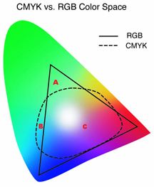
Because offset printing is defined in CMYK inks, any full color files you use must be converted to CMYK. The above image represents the color gamut. The large area shows visible color. The solid triangle shows the RGB color gamut and the dotted area shows the CMYK color gamut. If you use RGB-defined colors (the kind that come as defaults with many programs) they will be converted by us to CMYK. Since CMYK builds do not exactly match RGB formulas (many of these colors lying outside the CMYK gamut as represented above) we can not guarantee that the results will be satisfactory.
When providing spot color files using the Pantone Matching System (PMS), the spot colors must be defined correctly in each program used to build your page layout. They should be named the same from program to program and any unused colors should be deleted from the color palette. For example, if a logo created in Illustrator using PMS 185C is placed into InDesign, any other elements in the InDesign layout, such as a line or box, should use the same color defined as PMS 185C. You should not use PMS 185U or red for example. Just because they look similar on the monitor, does not mean they will separate correctly for printing.
Any color images that will be printed in grayscale should be converted prior to placement in the page layout program. Color images converted by us may appear darker or washed out because we will convert the document as a whole. Each individual element may need to be tweaked by you for your satisfaction. This can be done by adjusting contrast and brightness .
Solid black and white images should be converted at 600 ppi bitmap to be recreated smoothly. They should not be provided as grayscale.
